Print and Pattern Mixing
It’s been a while! There have been some exciting updates on the Pistachio front and I’m so excited to be working with more of you on your home projects. I recently took a step away from work for a week and a half to travel to Europe (like my last post!) - this time to London and Amsterdam. Both cities were full of friends, food, museums, and miles of walking (+ biking in Amsterdam!). But, as I told my boyfriend Will when we got home, I was struck by how truly inspired I was by all of the interiors we visited throughout our stay.
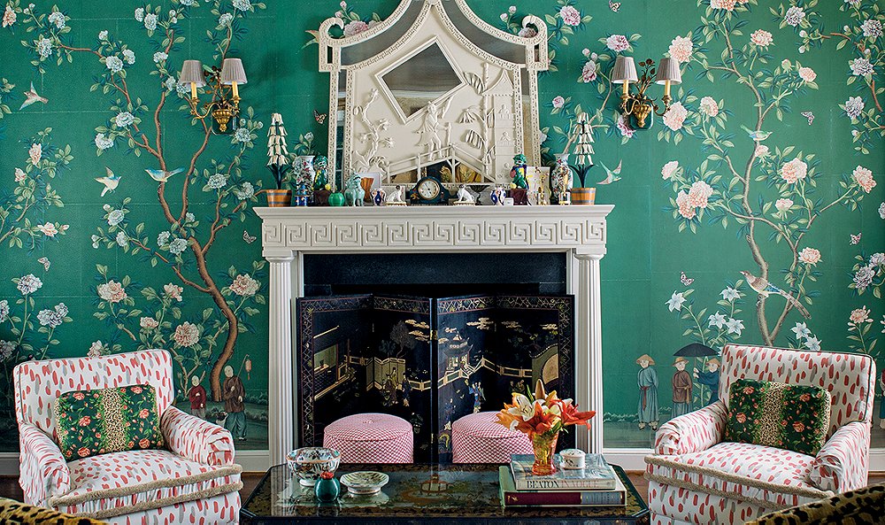
Combing through my photos from the trip, the common theme from my favorite spaces were how well designers mixed prints, patterns, and colors. Finding balance between so many different motifs can feel overwhelming, but the British have a way with making even the most unassuming color combinations work.

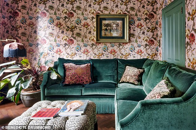
This photo that I uploaded to my Instagram was a space that best exemplified this decorating technique. I loved the color palette and the variety of textures in the textiles (plus the food here was A+!).
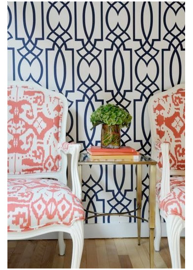
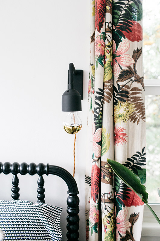
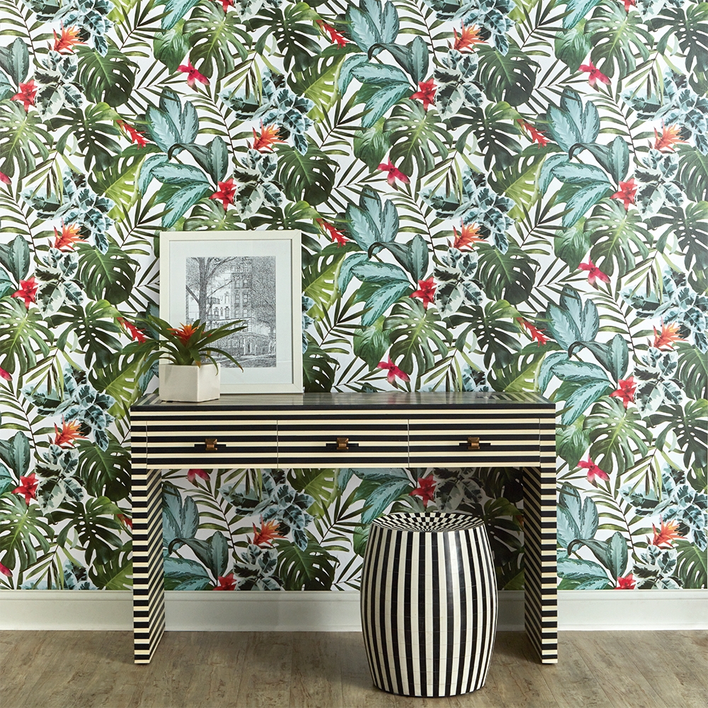
Here are some more examples of great pattern mixing that I will be referencing for new designs. Inspired and now interested in adding an unexpected wallcovering to your space (big or small)?! Let’s work together!